Grad4
A web application that helps suppliers and buyers in Québec to manage their manufacturing production.
Context
Work Experience
Role
Product Thinking
Product Design (UX - UI)
User Testing
Company
Design Team
Date
Sept. 2019 -> Sept. 2020
A web application that helps suppliers and buyers in Québec to manage their manufacturing production.
Work Experience
Product Thinking
Product Design (UX - UI)
User Testing
Sept. 2019 -> Sept. 2020

Being an integral part of the master I am pursuing at Montreal. I have the opportunity to work part-time in startups. Grad4 is the first startup that trusted me as soon as I arrived in Canada.
They needed designers to rethink their product on a more optimized version. So they gave us carte blanche to review the product first and design the new features.
The operation of the platform is quite simple: On the one hand, a user sends a request for quotation for the manufacture of a certain number of parts, on the other hand, people offer their prices by making bids. Then a winner is chosen and a contract is created between the two to ensure the creation of the parts.
The GRAD4 platform connects people in the manufacturing sector and targets two types of users:
Most of the work done at GRAD4 is for buyers. Indeed, they have often had to contact the after-sales service to request for quotation that they could not do online via the form.
The problem was that the form was not very readable or user-friendly. And above all, it was too restrictive when the user wanted to send more than 2 or 3 parts to be manufactured.
The old platform had a lot of problems in content and form. The colors were poorly chosen and the identity was old, the user had to fill out a very long form and the information was poorly prioritized on the interface. A lot of things had to be reviewed on this old version, so we were given carte blanche to design V2 with a new look.
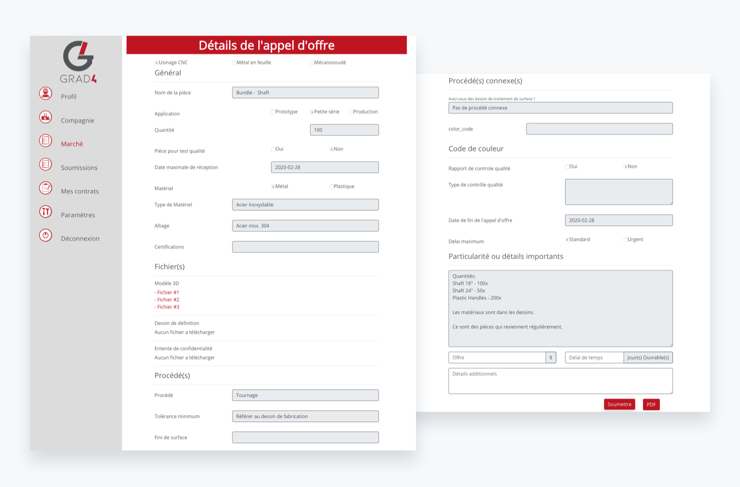
Old Request for Quotation form
How to simplify the creation of a request for quotation that can contain parts with different fabrications?
Our work focused on 3 main points:
After testing several wireframes on paper, we came up with a new workflow for the platform that made it easier to use.
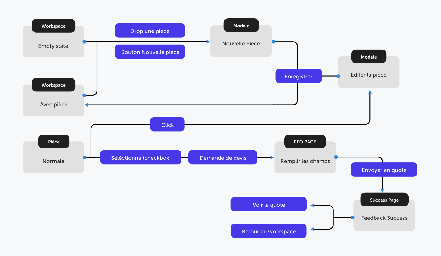
Interaction Map for the new workflow of the workspace
Instead of entering everything in a complex form, the user first defines his parts in a "workspace". Then he sends them to the marketplace through a very simplified RFQ form.
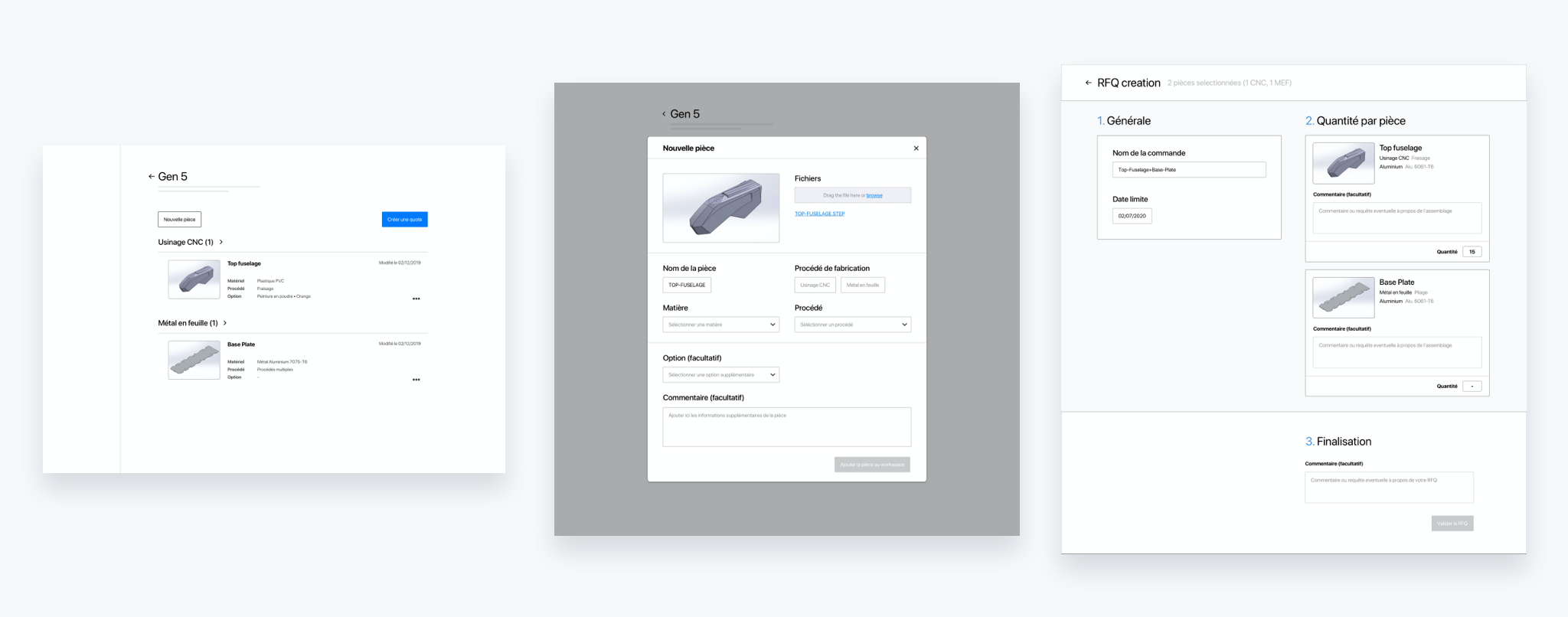
Wireframes
I had the opportunity to organize user testing sessions to test the first prototypes (wireframes).
These sessions follow a precise protocol determined in advance: first an explanation of the session, then a multi-step guided test that can be clicked on the prototype, followed by specific questions and open discussion. Tests were recorded by the webcam and the clicks on the screen to be able to review the screenings afterwards.
Tested Prototype
The approach was to get as much feedback as possible from people who had never been confronted with the future platform and to understand their understanding of it.
These feedbacks were then transcribed into a spreadsheet. This allowed us to see if there were any recurring comments or problems and to resolve them. As you can see on the right on the last column "resolution idea". These ideas were then re-discussed.
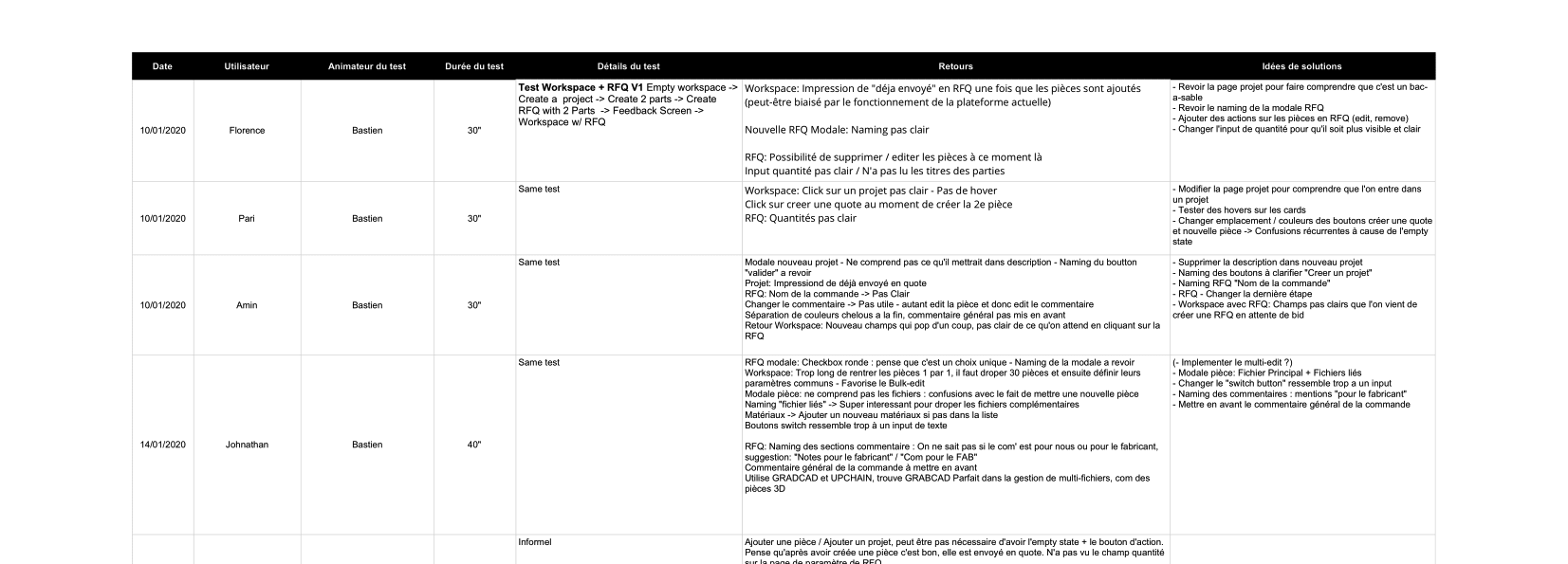
User Testing spreadsheet
During my year at GRAD4, I was able to explore the different phases of V2 design. From research to development follow-up. With always an iterative work throughout the process.
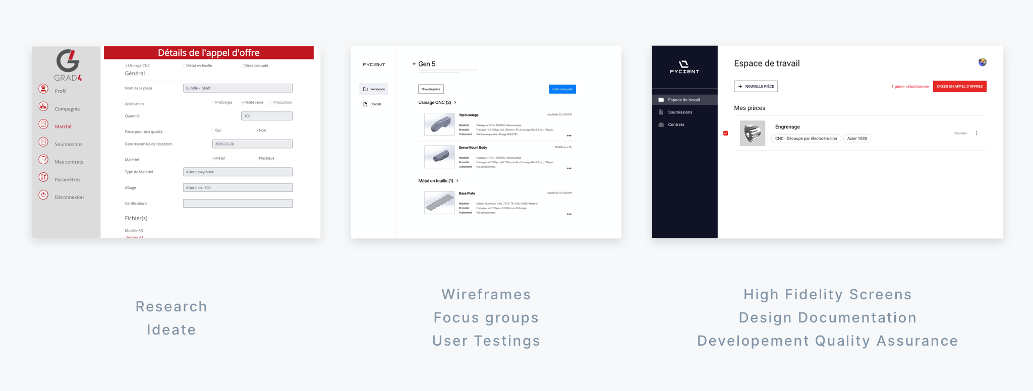
Design Process
We decided to start with a new, more modern UI, defining two main colors and basing the rest on Material Design, which will make the developers' work easier. It was also an opportunity to redesign the logo, which did not look good on small screens and was not very adapted to the audience.
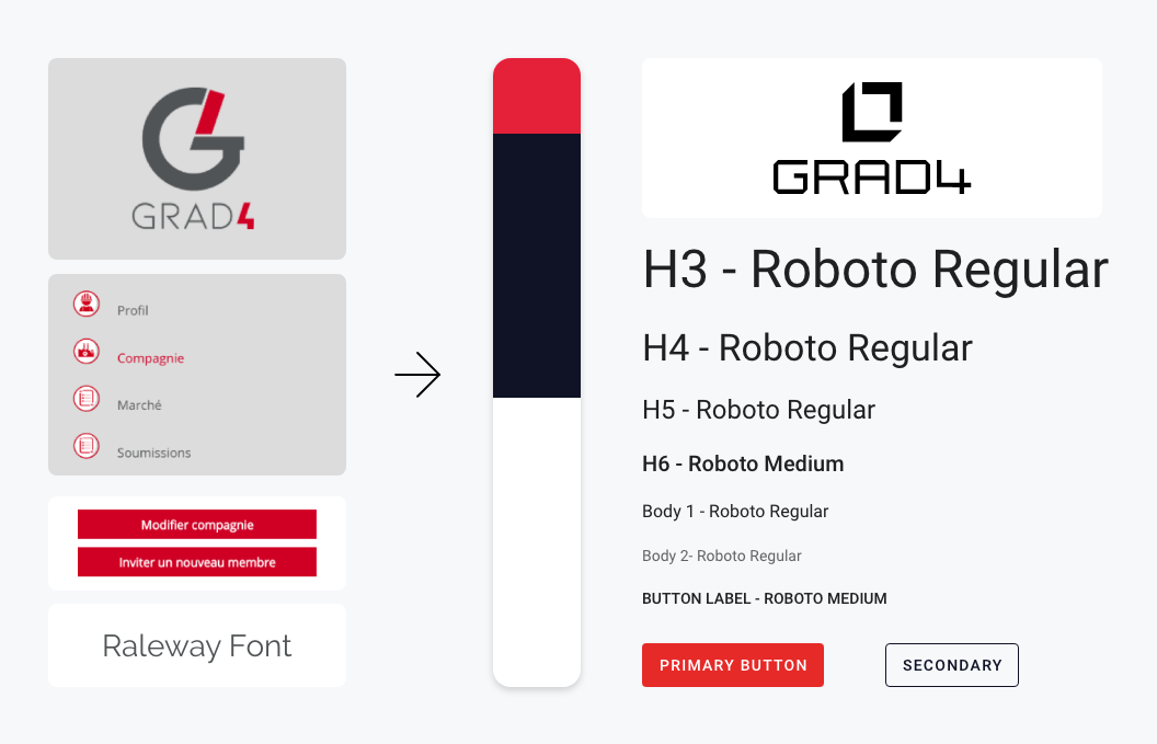
Fresh new UI guidelines
Here are some of the interfaces I've been working on this year at GRAD4. They are currently online on the platform and are used by over 500 users in Quebec.
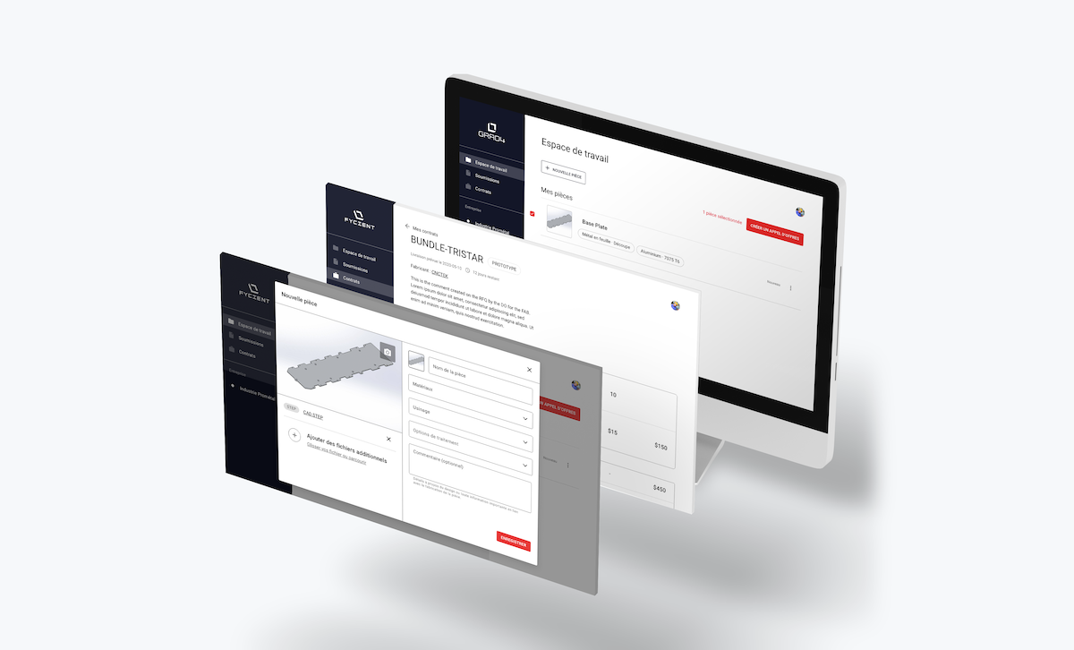
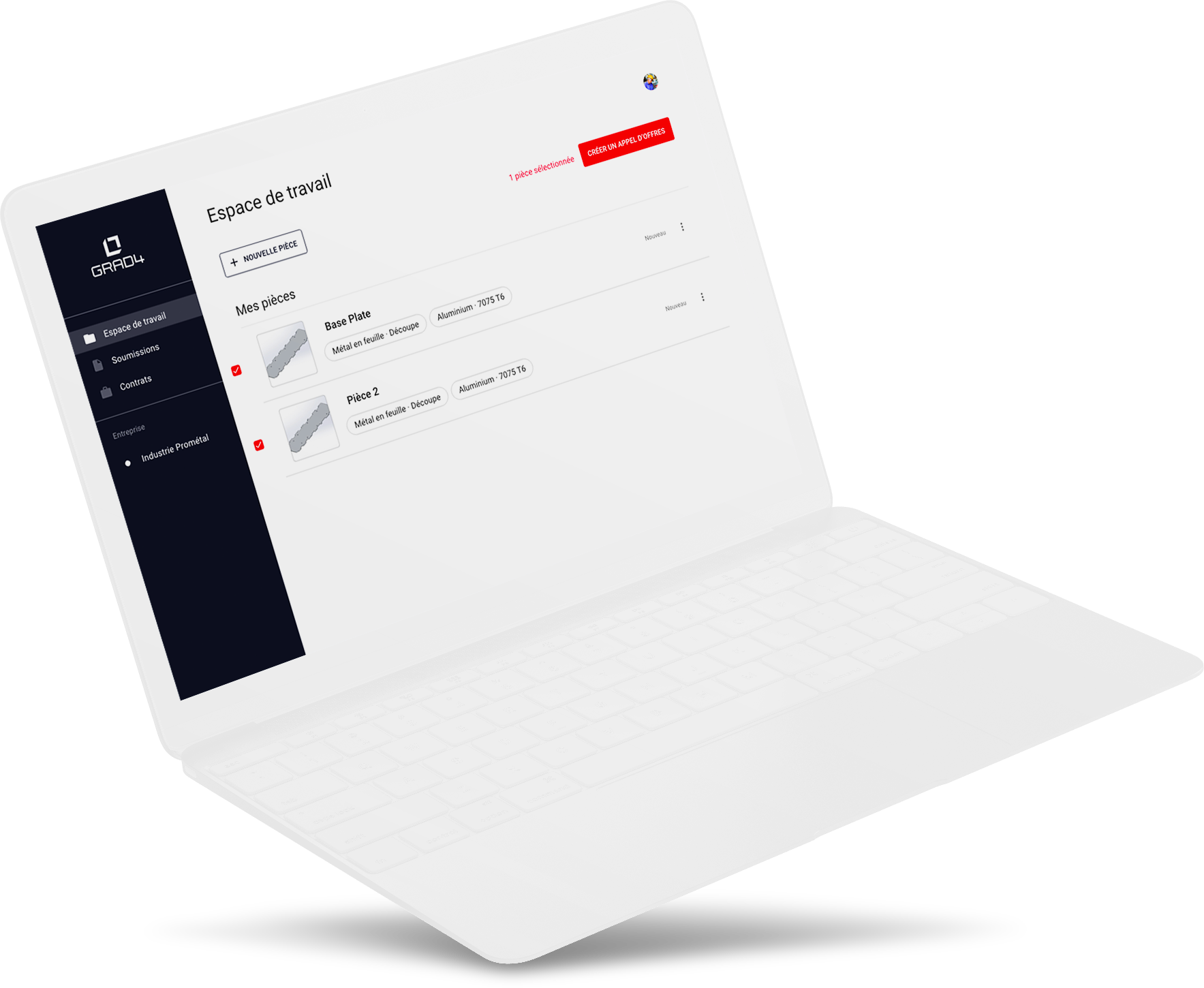
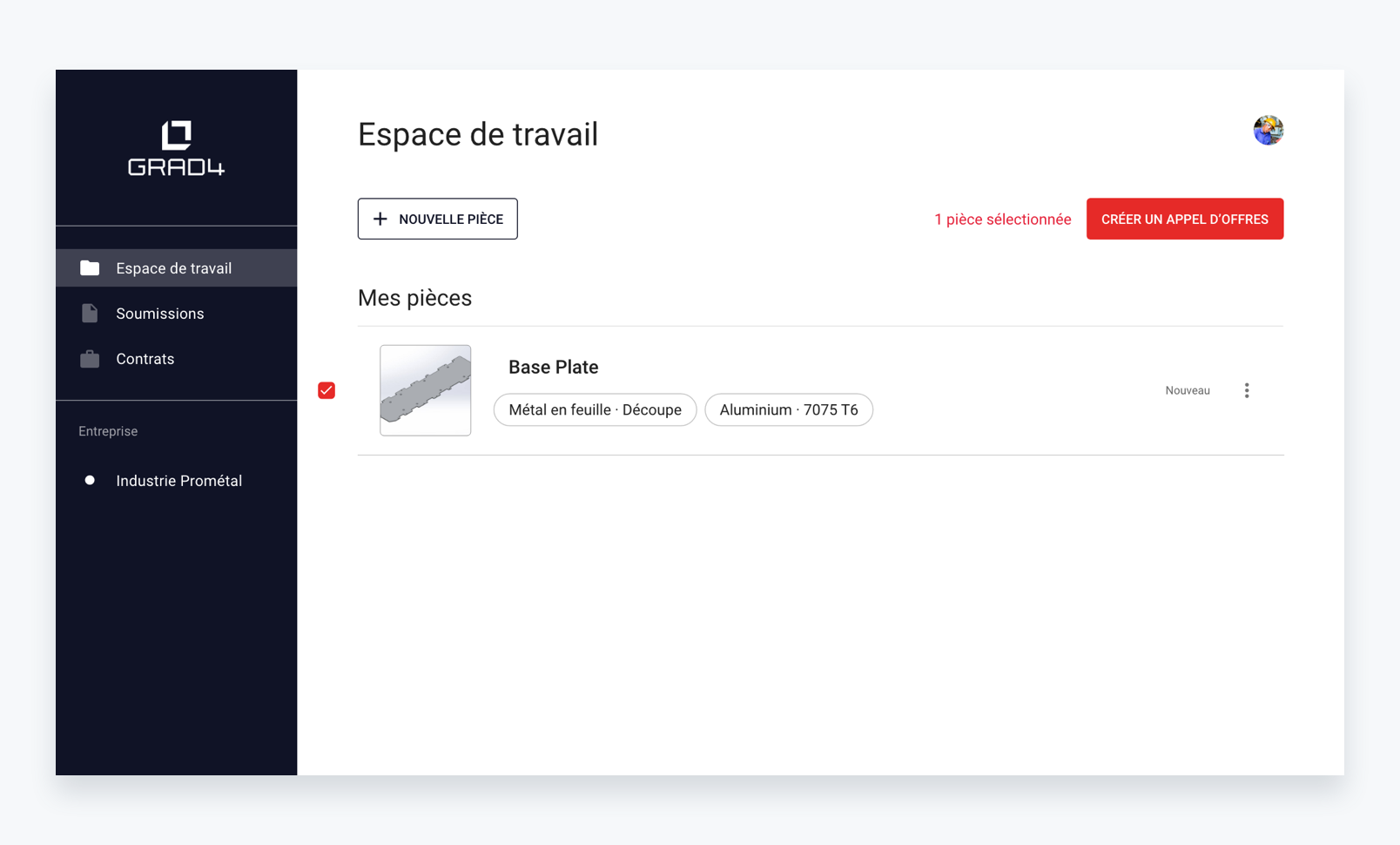
Main page for the supplier, where he creates parts, defines them and selects them to send them to an RFQ (Request for Quotation).
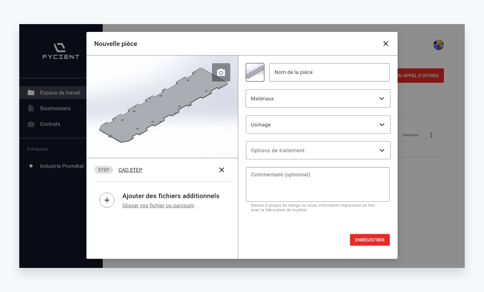
This is where the supplier can define his parts, with several files, comments, materials or the machining used.
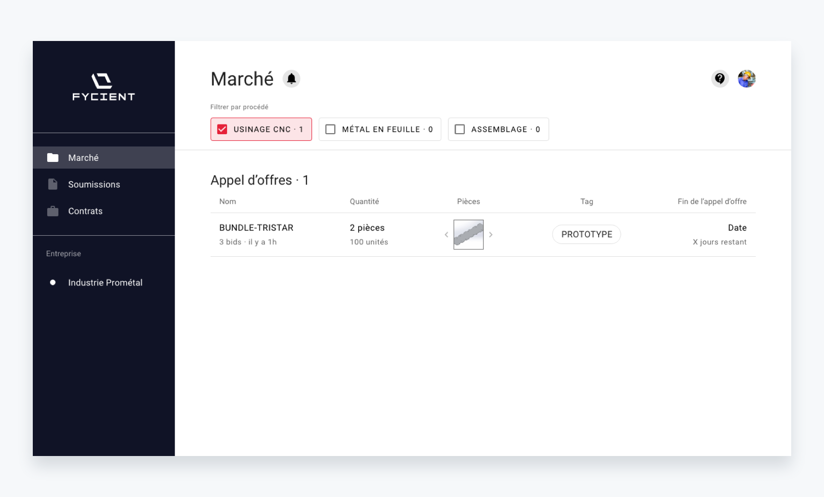
This is where all RFQs are bundled for manufacturers, who can filter the results related to their specialties.
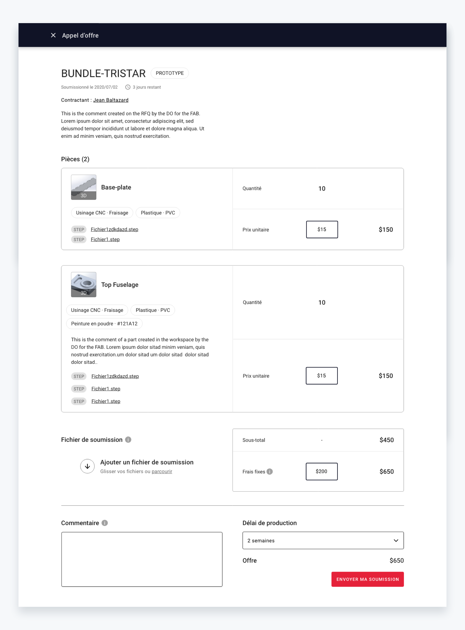
On this page the manufacturer can propose its prices in relation to the parts.
Here is the full workflow, from part creation to send a Request for Quotation on the marketplace.
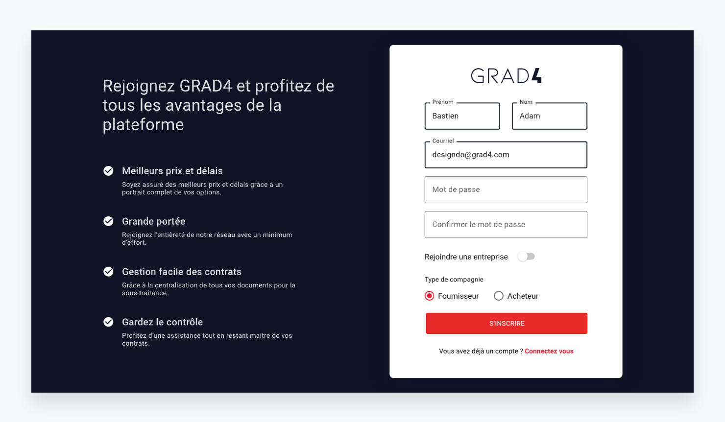
As a designer, my job was also to follow the development of the platform and make sure that the designs were well integrated.
We quickly realized that this was not the case at the beginning. Therefore, we decided to get a place that can be a Single Source Of Truth (SSOT), which allows us to always keep the designs up to date and to describe specific cases.
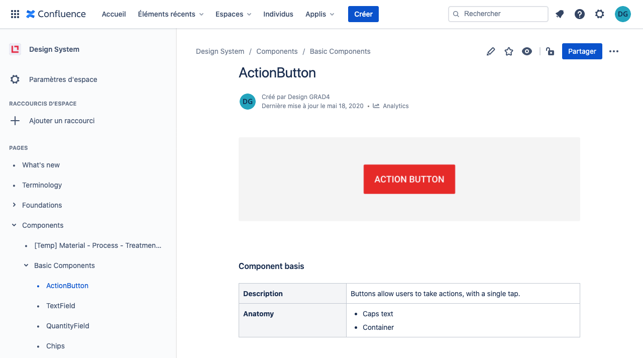
SSOT: Confluence page for Design documentation
I also worked on the showcase site by managing their WordPress. Since it's a startup it's the first impression the company gives online. So it was important to give it a modern look, to explain the advantages of the solution and to push to action to sign up with many CTAs.
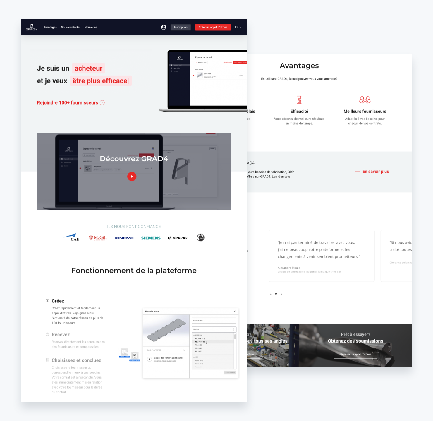
Show-up Website
It was a good opportunity to put everything I had learned in school into practice in a real project. It's always nice to see your work developed and working in real life compared to school projects for example.
